If, like me, you work in a small to medium sized enterprise where forecasting is still done with pen and paper, you’d be forgiven for thinking that Machine Learning is the exclusive preserve of big budget corporations. If you thought that, then get ready for a surprise. Not only are advanced data science tools largely accessible to the average user, you can also access them without paying a bean.
If this sounds too good to be true, let me prove it to you with a quick tutorial that will show you just how easy it is to make and deploy a predictive webservice using Microsoft’s Azure Machine Learning (ML) Studio, using real-world (anonymised) data.
What is Azure ML?
To most people the words ‘Microsoft Azure’ conjure up vague ideas of cloud computing and TV adverts with bearded-hipsters working in designer industrial lofts, and yet, in my opinion, the Azure Machine Learning Studio is one of the more powerful and leading predictive modelling tools available on the market. And again, its free. What’s more, because it has a graphical user interface, you don’t need any advanced coding or mathematical skills to use it. It’s all click and drag. In fact, it is entirely possible to build a machine learning model from beginning to end without typing a single line of code. How’s that for a piece of gold?
You can make a free account or sign in as a guest here – https://studio.azureml.net The free account or guest sign-in to the Microsoft Azure Machine Learning Studio gives you complete access to their easy-to-use drag and drop graphical user interface that allows you to build, test, and deploy predictive analytics solutions. You don’t need much more.
Microsoft Azure Tutorial Time!
I promised you a quick tutorial on how to make a forecast that drives purchasing and other planning decisions in Azure ML, and a quick tutorial you shall have.
If you’re still with me, here are a couple of resources to help you get rolling:
A great hands on lab: https://github.com/Azure-Readiness/hol-azure-machine-learning
Edx courses you can access for free: https://www.edx.org/course/principles-machine-learning-microsoft-dat203-2x-6
https://www.edx.org/course/data-science-essentials-microsoft-dat203-1x-6
Having pointed you in the direction of more expansive and detailed resources, it’s time to get into this quick demo. Here are the basic steps we’ll go through:
- Uploading datasets
- Exploring and visualising data
- Pre-processing and transforming
- Predictive modelling
- Publishing a model and using it in Excel
Uploading Datasets To Microsoft Azure
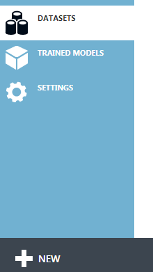
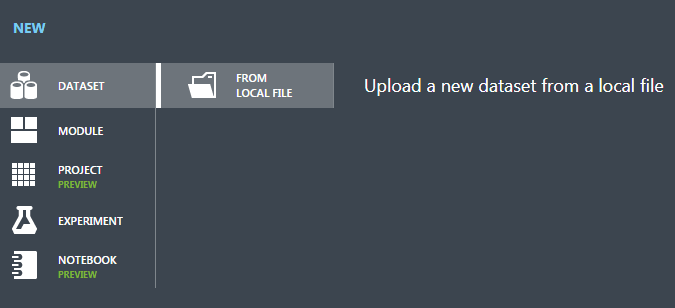
So, you’ve signed up. Once you’re in, you’re going to want to upload some data. I’m loading up the weekly sales data of a crystal glass product for the years 2016 and 2017 which I’m going to try and forecast. You can read in a flat file csv. format by clicking on the ‘Datasets’ icon and clicking the big ‘+ New’:
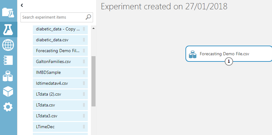
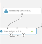
 Then you’re going to want to load up your data from the file location and give it a name you can find easily later. Clicking on the ‘flask’ icon and hitting the same ‘+ New’ button will open a new experiment. You can drag your uploaded dataset from the ‘my datasets’ list on to the blank workflow:
Exploring and Visualizing
Right clicking on the workflow module number (1) will give you access to exploratory data analysis tools either through ‘Visualise’, or by opening a Jupyter notebook (Jupyter is an open source web application) in which to explore the data in either Python or R code. If you want to learn how to use and apply Python to your forecasting, practical insights will also be revealed at IBF’s upcoming New Orleans conference on Predictive Business Analytics & Forecasting.
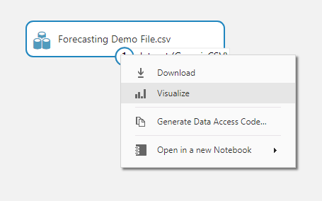
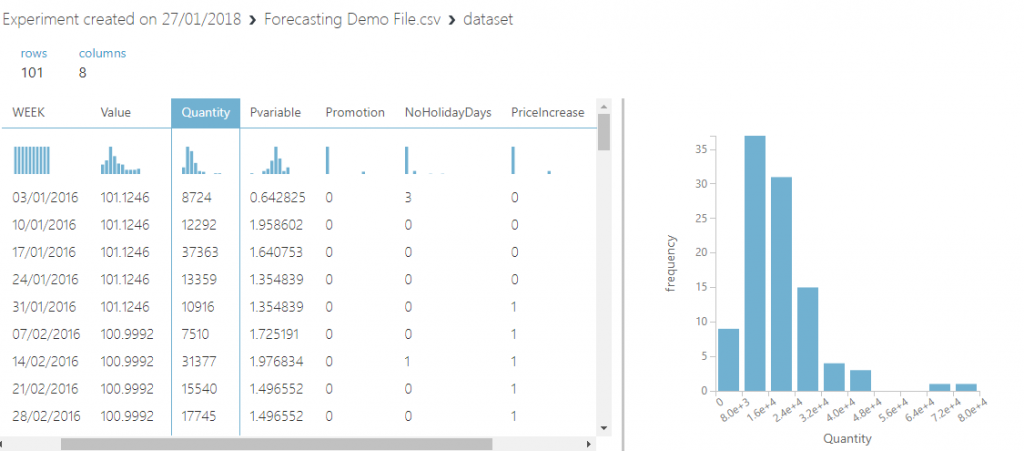
Clicking on the ‘Visualise’ option calls up a view of the data, summary statistics and graphs. A quick look at the histogram of sales quantity shows that the data has some very large outliers. I’ll have to do something about those during the transformation step. You also get some handy summary statistics for each feature. Let’s have a look at the sales quantity column.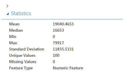
I’m guessing that zero will be Christmas week, when the office is closed. The max is likely to be a promotional offer. I can also see that the standard deviation is nearly 12,000 pieces, which is high compared to the mean. You can also compare columns/features to each other to see if there is any correlation:
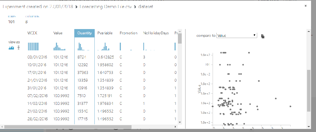 Looking at a scatter plot comparison of sales quantity to the consumer confidence index value, that really doesn’t seem to be adding anything to the data. I’ll want to get rid of that feature. I’ve also included a quick Python line plot of sales over the two-year period.
 As you can see, there is a lot of variability in the data and perhaps a slight downward trend. Without some powerful explanatory variables, this is going to be a challenge to accurately forecast. A lot of tutorials use rich datasets which the Machine Learning systems can predict well to give you a glossy version. I wanted to keep this real. I work in an SME and getting even basic sales data is an epic battle involving about fifty lines of code.
Pre-processing and Transforming
Now it’s time to transform the data. For simplicity, I’ve loaded a dataset with no missing or invalid entries by cleaning up and resampling sales by week with Python, but you can use the ‘scrub missing values’ module or execute a Python/R script in the Azure ML workspace to take care of this kind of problem.
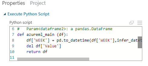
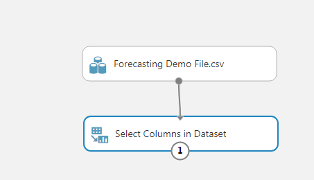
In this case, all I need to do is change the ‘week’ column into a datetime feature (it loaded as a string object) and drop that OECD consumer confidence index feature as it wasn’t helping. I could equally have excluded the column without code using the select columns module:
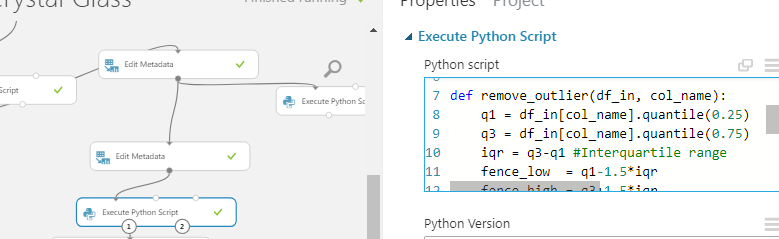
One of the other things I’m going to do is to trim outliers from the dataset using another ‘Execute Python Script’ module to identify and remove outliers from the sales quantity column so the results are not skewed by rare sales events.
 Again, I could have accomplished a similar effect by using Azure’s inbuilt ‘Clip Values’ module. You genuinely do not have to be able to write code to use Azure (but it helps.)
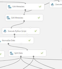
There are too many possible options within the transformation step to cover in a single article. I will mention one more important step. You should normalise the data to stop differences in scale of the features leading to certain features dominating over others. 90% of the work in forecasting is getting and cleaning the data so that it is usable for analysis (Adobe, take note. Pdf’s are evil and everyone who works with data hates them.) Luckily, you can do all your wrangling inside the machine model, so that when you use the service, it will do all the wrangling automatically based on your modules and code.
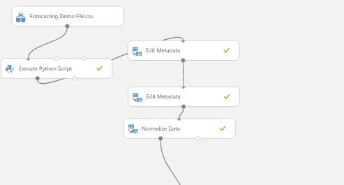
The Normalize data module allows you to select columns and choose a method of normalisation including Zscores and Min-Max.
Predictive Modelling In Microsoft Azure
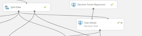
Having completed the data transformation stage, you’re now ready to move on to the fun part – making a Machine Learning model. The first step is to split the data into a training set and a testing set. This should be a familiar practice for anyone working in forecasting. Before you let your forecast out into the wild you want to test how well it performs against the sales history. It’s that or face a screaming sales manager wanting to know where his stock is. I like my life as stress-free as possible.As with nearly everything in Azure ML, data splitting can be achieved by selecting a module. Just click on the search pane and type in what you want to do. I’m going to split my data 70-30.
The next step is to connect the left output of the ‘Split Data’ module to the right input of a ‘Train Model’ module, the right output of the ‘Split Data’ to a ‘Score Model’ module, and a learning model to the right input of the ‘Train model’.
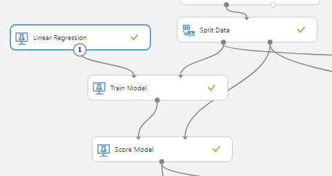
At first this might seem a little complicated, but as you can see, the left output of the ‘Split Data’ is the training dataset which goes through the training model and then outputs the resulting learned technique to the ‘Score Model’ where this learned function is tested against the testing dataset which comes in through the right data input node. In the ‘Train Model’ module you must select a single column of interest. In this case it is the quantity of product sold that I want to know. 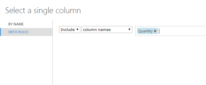
Microsoft offer a couple of guides to help you choose the right machine learning algorithm. Here’s a broad discussion and if short on time, check this lightning quick guidance. In the above I’ve opted for a simple Linear Regression module and for comparison purposes I’ve included a Decision Forest Regression by adding connectors to the same ‘Split Data’ module. One of the great things about Azure ML is you can very quickly add and compare lots of models during your building and testing phase, and then clear them down before launching your web service.
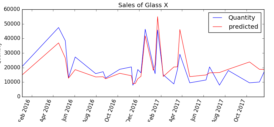
Azure ML offers a wide array of machine learning algorithms from linear and polynomial regression to powerful adaptive boosted ensemble methods and neural networks. I think the best way to get to know these is to build your own models and try them out. As I have two competing models at work, I’ve added in an ‘Evaluate Model’ module and linked in the two ‘Score Model’ modules so that I can compare the results. I’ve also put in a quick Python script to graph the residuals and plot the forecasts against the results.
Here’s the Decision Forest algorithm predictions against the actual sales quantity:
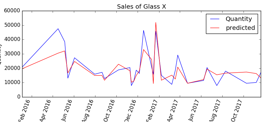
Clearly something happened around May 2016 that the Decision Forest model is unable to explain, but it seems to do quite well in finding the peaks over the rest of the period 2017. Looking at the Linear Regression model, one can see that it does a better job of finding the peak around May 2016 but is consistently overestimating in the latter half of 2017.
Clicking on the ‘Evaluate Model’ module enables a more detailed statistical view of the comparative accuracy of the two models. The linear regression model is the top row and the decision forest model is the bottom row.
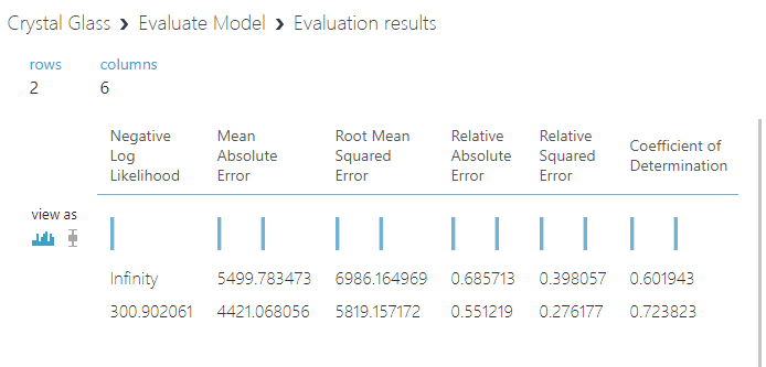
Coefficient of determinations of 0.60 and 0.72. The models are explaining between half and three-quarters of the variance in sales. The Decision Forest overall scored significantly better. As results go, neither brilliant nor terrible. A perfect coefficient of determination of 1 would suggest the model was overfitted and therefore unlikely to perform well on new data. The range of sales was from 0 to nearly 80,000, so I’ll take 4421 pieces of mean absolute error without a complaint.

It would really be ideal if we had a little more information at the feature engineering stage. The ending inventory in-stock value from each week, or customer forecasts from the S&OP process as features would help accuracy.
One of the benefits of forecasting in this way is you can incorporate features without having to worry about how accurate they are as the model will figure that out for you. I’d recommend having as many as possible and then pruning. I think the next step for this model would be to try incorporating inventory and S&OP pipeline customer forecasts as a feature. Building a model is an iterative process and one can and should keep improving it over time.
Publishing A Model And Consuming It In Excel
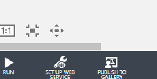
Azure ML makes setting up a model as a webservice and using it in Excel very easy. To deploy the model, simply click on the ‘Setup Web Service’ icon at the bottom of the screen.
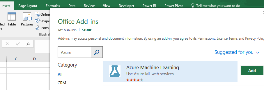
Once you’ve deployed the webservice, you’ll get an API (Application Programming Interface) key and a Request Response URL link. You’ll need these to access your app in Excel and start predicting beyond your training and testing set. Finally, you’re ready to open good old Excel. Go to the ‘Insert tab’ and select the ‘Store’ icon to download the free Azure add-in for Excel.
Then all you need to do is click the ‘+ Add web service’ button and paste in your Response Request URL and your secure API key, so that only your team can access the service.
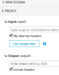
After that it’s a simple process to input the new sales weeks to be predicted for the item and the known data for other variables (in this case promotions, holiday days in the week, historic average annual/seasonal sales pattern for the category etc.). You can make this easy by clicking on the ‘Use sample data’ to populate the column headers so you don’t have to remember the order of the columns used in the training set.

Congratulations! You now have a basic predictive webservice built for producing forecasts. By adding in additional features to your dataset and retraining and improving the model, you can rapidly build up a business specific forecasting function using Machine Learning that is secure, shareable and scalable.
Good luck!
If you’re keen to leverage Python and R in your forecasting, we also recommend attending IBF’s upcoming Predictive Analytics, Forecasting & Planning conference in New Orleans where attendees will receive hands-on Python training. For practical and step-by-step insight into applying Machine Learning with R for forecasting in your organization, check out IBF’s Demand Planning & Forecasting Bootcamp w/ Hands-On Data Science & Predictive Business Analytics Workshop in Chicago.